Re-Design STRAVA App
Product Analysis / Rebuild Structure
User Review Analysis / Product Development
Re-Designed for User Needs
STRAVA is most popular GPS activity tracker App in the health part, it is operating with website and mobile. STRAVA is used to track athletic activity via satellite navigation and share their activities.
Proficiency: UX/UI Design, UX Research, Visual Design, Interaction Design, Mobile Design, UX Analysis,

CHALLENGE
STRAVA is the most rated application to provide a activity tracking and management activity. STRAVA should more communication with users and provide a new way of communicating to the athletic community. I am cyclist, so I want try to rebuilt the features that I felt.
DESIGN PROCESS
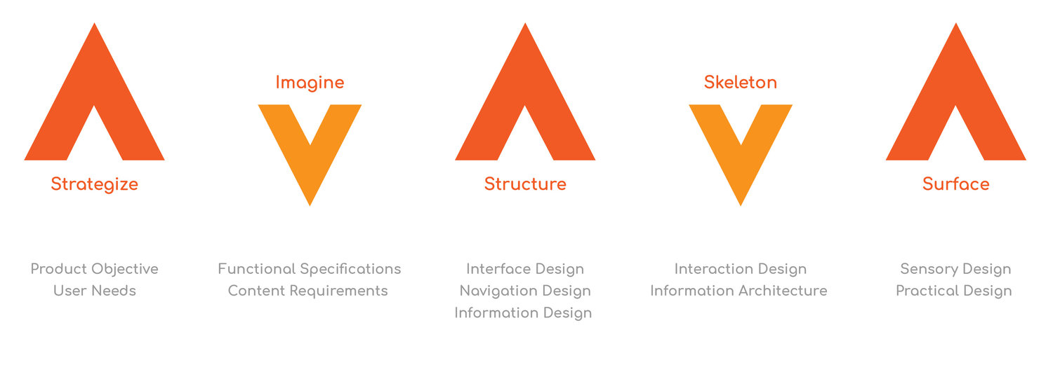
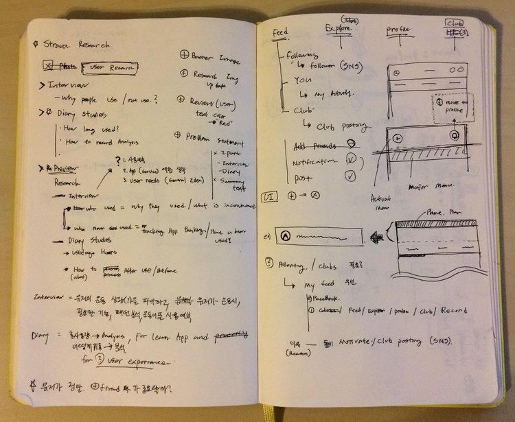
RESEARCH
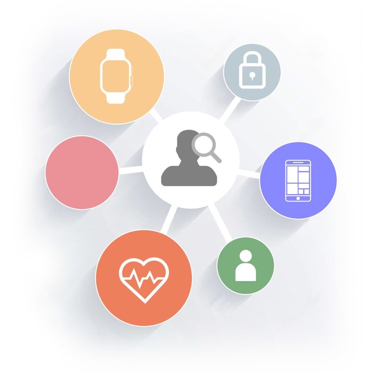
Identifying issues and making them specific and feasible is crucial to providing better service to users. I needed to research external app knowledge for better understanding.
Starting with a Question
Who have same issue with my experience?
When user needs this app? (Purpose)
Where I can collect user's data?
What is user needs?
How to feedback user needs?
Why user unhappy?
Reviewing the fitness tracking apps with STRAVA
Function
Premium Policy
Discern Difference
Usability
STRAVA Usability Test
COMPARE & ANALYSIS
Reviewing the top fitness tracking apps currently in the Google Play and Apple store to understand which features are prominent and how the workflows different.
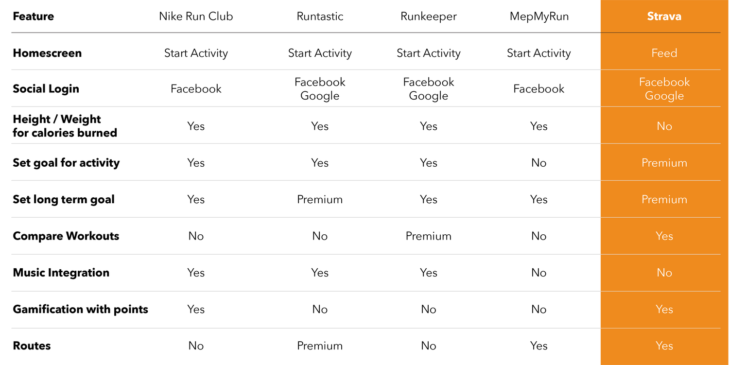
STRAVA EVALUATION version 46.0.0
Well, what do I think?
After scrutinizing the UI/UX of STRAVA app in version 46.0.0, I have come to the evaluation conclusions: Disordered architecture, Chaotic searching systems.
Feed: Information Overfull
The same information overlaps and displays information more than necessary.
Search: Intricated Navigation
Too much search features that have not been cleaned up and complexity in use.
Profile: Inappropriate Content
Duplicate functions in 'More' category and unnecessary functions for user to exercise management and design
Annoying UI: Inordinacy Upper UI
Different upper UI pattern of confusion and low usability
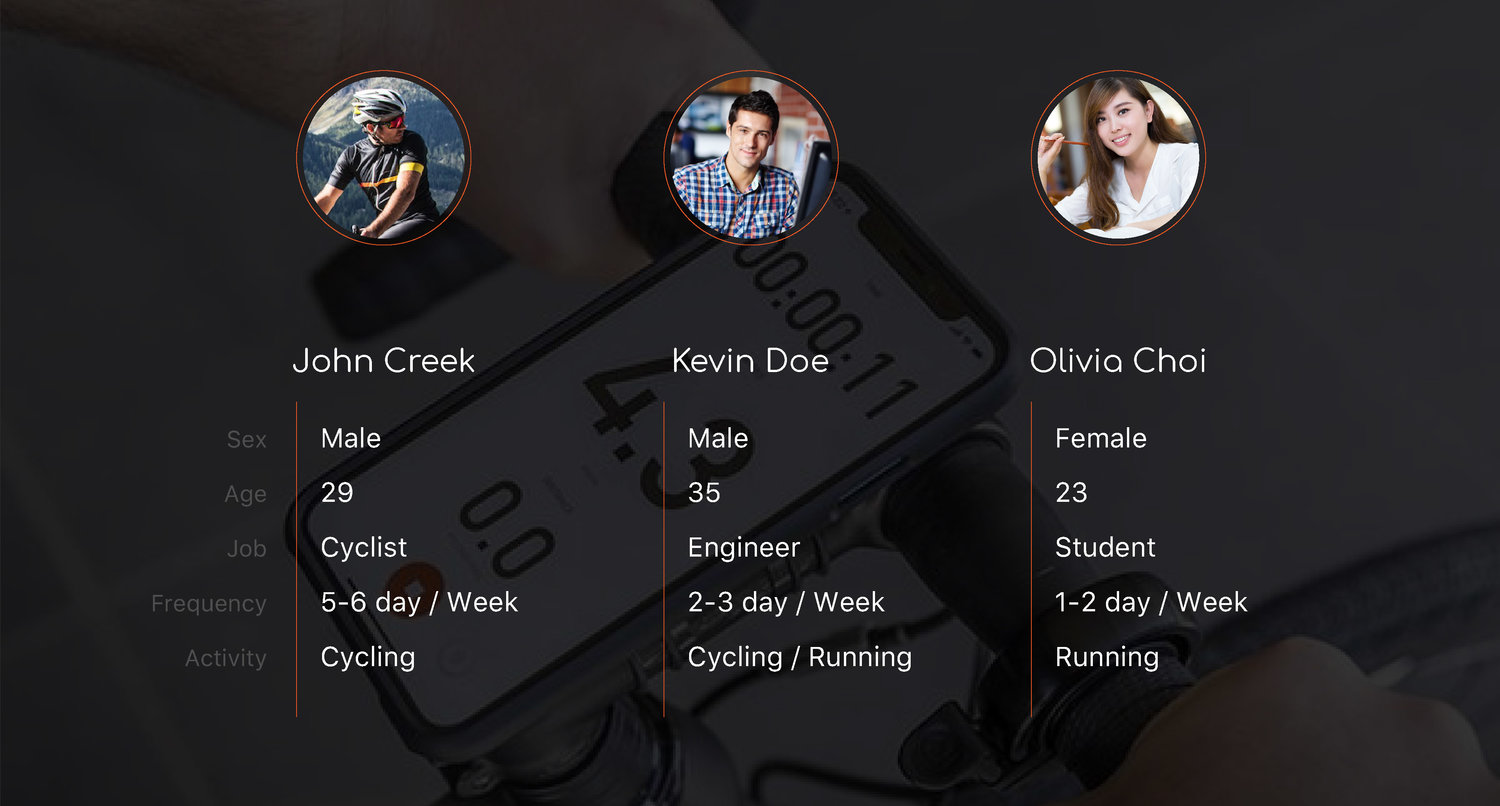
USER REVIEWS ANALYSIS
Over 50% of users gave five stars in IOS and Android. However, users who gave 1 to 4 stars and 5 stars pointed to the same problem. In other words, the users who recorded five stars, their used it from a long time ago, or used it as a recommendation from others. On the other hand, most of the users who recorded 1 ~ 3 star as new users.
Five Stars Users
Tolerant
Lots of customers show their tolerance of usability and experienced long-time used.
They just believe in blindly. It is relatively frequent updates and many people use it.
Some users write a review for long-term improvement about more additional option that connectivity and compatibility with external devices.
Users Needs
Criticism
Most user felt confusing by exposing too much information such as other activity with my activity and ads.
Different kind of exercise requires different interface.
More detailed exercise management function to suit the purpose of the application such as information of chronotropic, pace goal, and run distance.
Easy and convenient interworking and exchange of information with external devices
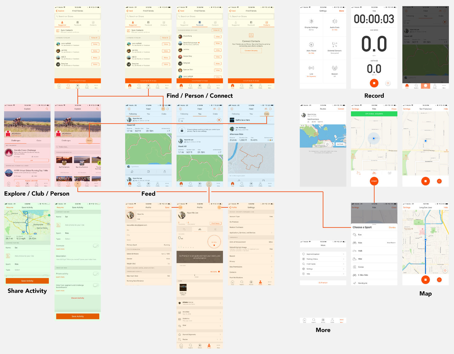
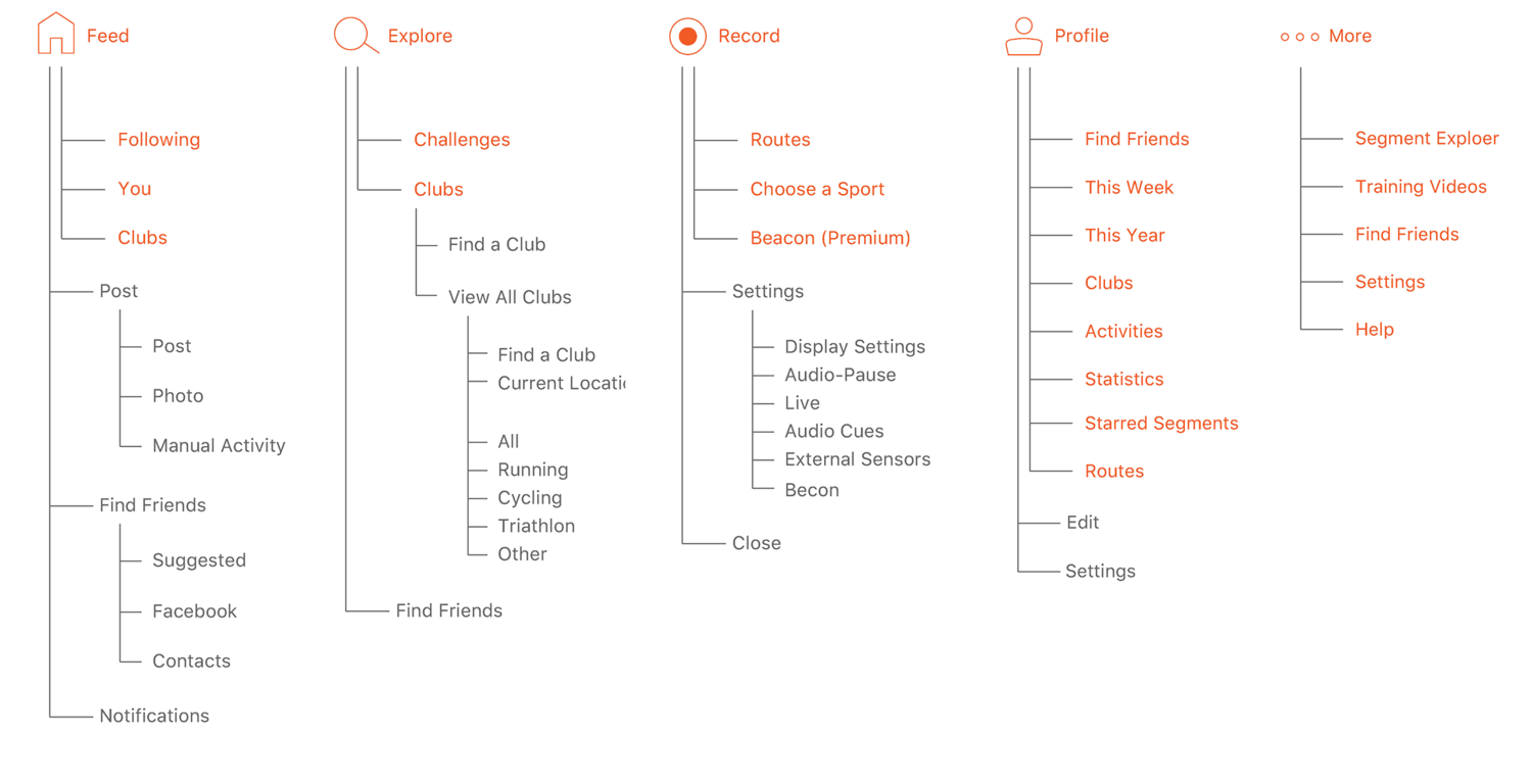
INFORMATION ARCHITECTURE

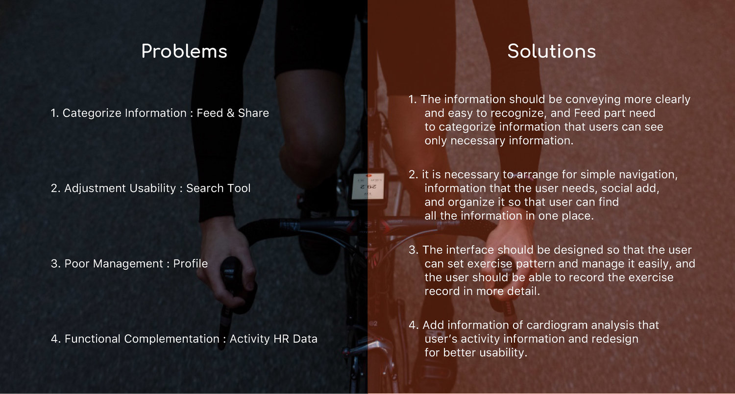
PROBLEM STATEMENT

+
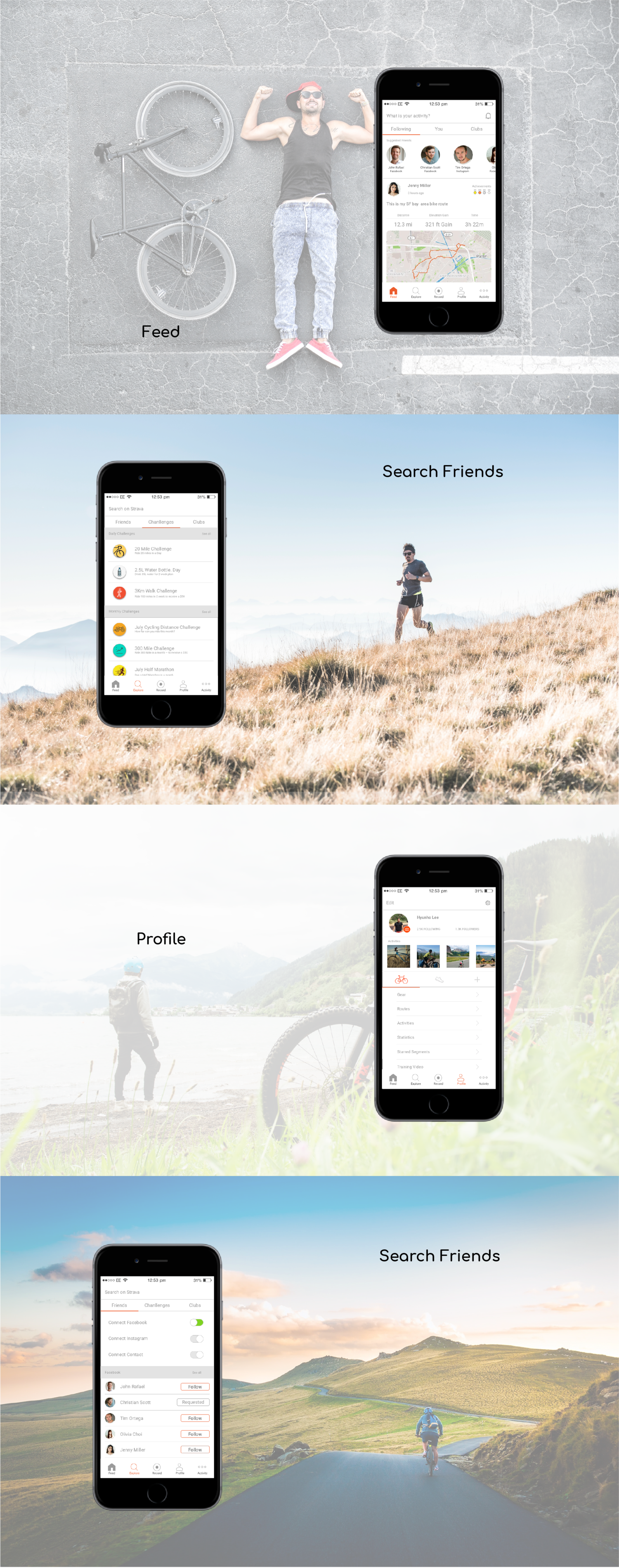
Categorize Information : Feed & Share
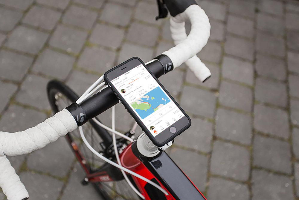
The feed shows activity in three ways: 'Follow’, ‘Me' and 'Club’ parts. However, all three parts show my current activities. Also, other people’s activities were presenting on following and club parts.
Actual users are exposed to too much athletic activity, information duplication in two or three ways that user feel confusing.
Adjustment Usability : Search Tool
Explore is designed to find challenges and club activities. However, the search icon on the top menu bar has the ability to add friends. user can also add friends in feed, profile, and more parts.
The user has too much search functions and the segmented search functions are rather inconvenient to users.
Poor Management : Profile
The profile automatically sets a list of different activities which is users do not want see and use.
STRAVA users want to see more detailed exercise records and want to analyze the activates patterns interpreted in various ways.
Functional Complementation : Activity HR Data